Creating a beautiful newborn gallery for your clients not only involves beautiful posing, camera knowledge and technical execution - but also involves color and theme planning for the entire session.
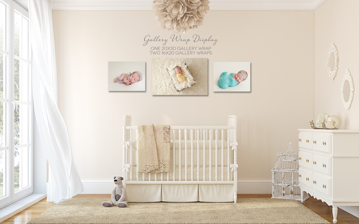
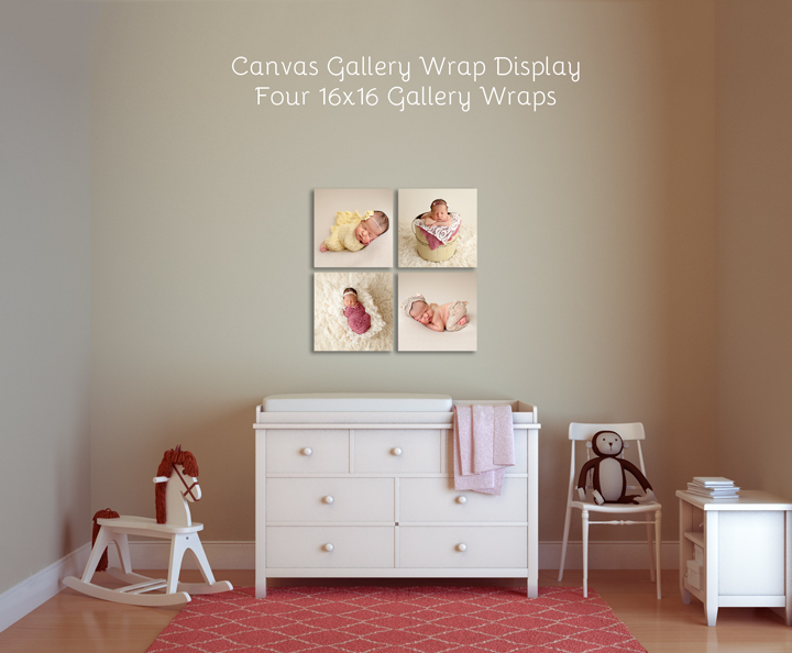
Think about it - what is your goal? Is your goal to sell a beautiful wall display, custom framed prints or gallery wrapped canvases? Whatever your goal may be, it is important to think about how all of your images from the session will look together - when placed side by side in a beautiful wall display or even on a birth announcement. Will the colors and textures compliment each other? Do the lighting and skin tones match up?
Say for example, that you have a little boy coming in your studio. You are SOOOO excited to try everything out, new blankets, baskets, hats and wraps! You haven't seen a boy in a while, and you can't wait just to throw everything on him and take your props for a test drive! Well... hold on just a second. Before you place him on a blue blanket, with a green wrap and a red hat - lets just take a moment to step back and think about the basics of color theory.
When planning a session, it helps to pick one main color that will be present in all shots - then add complementary colors to the images to add a bit of interest and to complement (yes I said complement... not over power) the image (or baby!) as a whole.
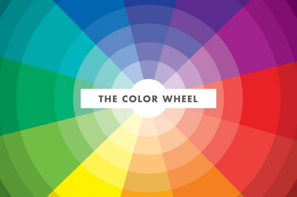
Take a look at the color wheel. The colors that fall on the opposite side of each other, complement each other nicely. For example, blue and orange are a winning combination - but blue and green, not always. Use the color wheel to check combinations frequently - it really helps when planning a session as a whole.
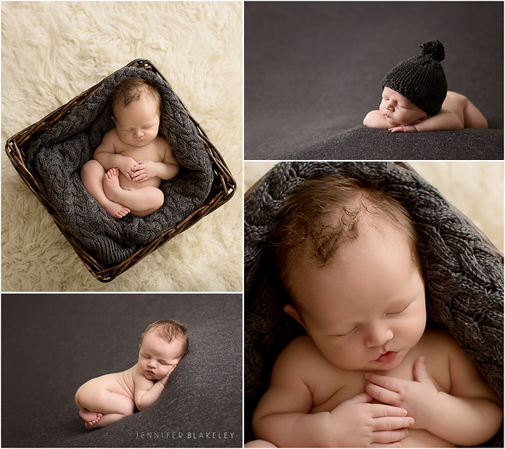
If you are looking to use more muted natural tones, the theory of a simple solid session theme still applies. For example, if you want to put the baby boy on a grey blanket - also make sure that grey is used in his basket shots to bring the gallery and images together. This makes for a consistent and flowing session - that will look great on a wall!
Here are some helpful things to remember when pulling props for your session are:
- Keep it simple – simple goes a long way.
- Select colors and props that will not over power your very important subject, YOUR BABY.
- Ask your clients what they plan to do with their images or where plan to display their images. This can help you select colors that will look nice on your clients’ walls. Maybe they plan on displaying them in baby’s nursery or in their main living space. The color of the walls and décor are important information to take into consideration when you are selecting props and colors for your session.
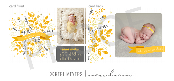
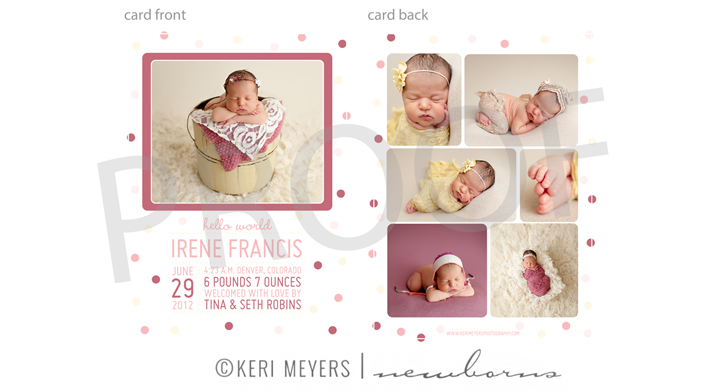
- Keep in mind these images will likely be presented on a birth announcement, in an album, or on a wall together. Do they compliment each other and follow a color theme?